Space….. Not outer space, but the space that’s all around us. The space that differentiates between what’s close to you and what’s far away. That’s easy to do in real space. If it’s close enough, you can reach out and touch it. If it’s far away, you can’t.
But there is no real space on a 2 dimensional surface like your paper. Space in a picture is an illusion. The artist has to employ “tricks” to achieve the illusion of depth and space. The “tricks” we are going to discuss are size, placement, overlapping, and perspective. I mention perspective now, but it’s really a higher level skill that deserves more attention. So we will be spending more time in the up coming weeks with perspective.
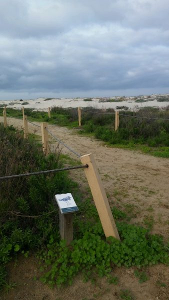
Last week we talked about COMPOSITION with it’s foreground, middle ground, and background. Foreground is the closest to the viewer and placed at the bottom of the page. Middle ground is in the middle, and since the background is the farthest away, it’s placed at the top of the paper. Let’s use this beach picture for reference.

You can see the post and some greenery in the foreground at the bottom of the picture. More posts, a path, and more greenery in the middle, and a sandy beach in the background closer to the top of the picture. Sky is never really considered background.
The illusion of SIZE is very simple, the closer the object is to the viewer, the larger it appears, and it’s placed near the bottom of the picture. In the case of our beach pic, it’s the sign post and the first roped off post. The farther away the posts get, the smaller they look.
We have been including the “trick” of PLACEMENT as we’ve been talking about size and composition. Objects closest to the viewer are placed at the bottom, things farther away are nearer the top of the page. The sandy beach in our example is the background and is placed higher on the paper.
The beach photo isn’t the best image to demonstrate OVERLAPPING, but if you look you can find some. The green leafy bush is “overlapping” the post at the bottom, giving the illusion that the leafy bush is IN FRONT OF the post. You know that because you can see all the the leafy bush, but only the top of the post. The bottom of the post is covered up. Plus the green bush is lower on the paper than the post.
Finally PERSPECTIVE as a space/depth illusion. This picture shows the simplest 1 point perspective in the sandy path that travels between the posts to the beach. The path gives the illusion of depth as it starts wide at the bottom, and gets narrower as it travels up the page, and would come together at a single point on the horizon (if we could see it beyond the picture frame). Perspective is an intermediate skill that we will go into more in the upcoming weeks.
With these tricks in your tool box of drawing techniques you can add great depth and space in your landscape images.
